Massings
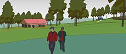
 TRADITIONAL This one is a traditional pitched roof, about 45 degree angle, which would be metal most likely. The building is kinked slightly to embrace the space on the south side of the building (what we're looking at). This would be very easy to build since almost every building in New England looks like this. One nice feature of this kind of design is the large roof area that's visible, which is missing in some of the designs below. You can check out how not seeing the roof changes the feeling of a building.
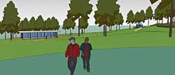
 GLASS Here's kind of a joke, but interesting. This is a glass house design with a flat roof. Contrast this with the prior model. A very different feeling. I don't think this would be practical but it's kind of the other end of the extreme from a standard pitched roof with solid walls.
 CRUSH This was the first massing experiment I did. I was thinking about a green roof and what kind of surface would be appropriate for that. I thought that perhaps a multi-pitched roof would look kind of cool mimicking the terrain. I still think it would look pretty cool, but my feeling is all the angularity actually disguises the building. Even in this simplified model the complexity makes the building a lot less clear. It would be a lot harder to build too.
 SLANT Here's the same shape building as the pitched roof but with a big slanty roof. I like the way this design counterpoints the downward slope of the land with a rising roof. I think I'll play with this one a bit more, trying to angle the roof so that it's more visible from the circle.
 CUBES Some cubes to mimic the bathhouse, which is also a cube of sorts with a pyramid roof. The idea here was to have the kitchen and dining areas each in a separate space. It looks a little too much like a commercial mall building for my taste, but I think that could be dealt with. My feeling is that the kitchen and dining space should be one however, so that the cooks don't cut off from social activities. More on this later.
Comments welcome.


0 Comments:
Post a Comment
<< Home